How to Pick The Best Color to Paint Inside of House: Expert Tips and Tricks
I’ve been down this road before. Moving in to a new home and trying to decide what colors I should paint all of the walls in my whole house.
It can be a traumatizing experience.
I actually wrote a blog post on how to start decorating your home when you have no idea where to start. I do suggest before you put a paint brush to any of your walls, you live in your space for a bit.
And then jump on Pinterest and start finding inspiration.
Choosing the right color to paint the interior of your house is a hard decision that requires lots and lots of thought (and decision paralysis)
As you begin your (long) search for the ideal color, it’s so important to take into account your personal preferences, design goals, and the function of each room.
One popular approach to selecting the best paint color (which I fail to do quite often) is to consider the color psychology and how it can influence the feel of a room.
For those of you that are into color psychology, soothing shades, such as light blues and greens, are ideal for creating a calm and restful environment in bedrooms or bathrooms.
On the other hand, warmer tones, such as yellows or oranges, are known to evoke feelings of energy and happiness, making them suitable choices for social spaces like living rooms and kitchens.
In addition to color psychology, it is very important (maybe even more important) to pay attention to the natural light in your home. Rooms with abundant sunlight can handle deeper or richer colors, while those with limited natural light may benefit from lighter, more reflective shades to create a bright and airy atmosphere.
I say it all of the time when I write a blog post about any paint color and I will say it again…sampling your paint in your home is one of the most important steps you can do. A paint color can look completely different in two separate rooms.
And they can look completely different in the morning and at night.
I get my paint samples from Samplize and I have them on my walls for a few days before I make any decisions.
The main goal is to find the perfect balance that complements your home’s style and reflects your personal style.
Psychology of Colors
Warm Colors
Warm colors include shades of red, orange, and yellow. These colors evoke feelings of warmth, comfort, and energy and are ideal for kitchens or dining areas. However, they should be used with caution in bedrooms as they may cause overstimulation and disturb sleep.
Here are some warm colors and their effects:
Red: Passion, excitement, and energy
Orange: Optimism, enthusiasm, and sociability
Yellow: Happiness, concentration, and clarity
For the past few years I have shied away from bold and dark warm colors in my home. It’s been a while since I have seen a red kitchen or thought to ever paint a room dark red.
But…like all things, I am seeing a rise in bold colors in homes so maybe red kitchens are making a comeback?!?
Cool Colors
Cool colors seem to be popular and timeless paint choices and include shades of blue, green, and purple. These colors evoke feelings of calm, relaxation, and tranquility.
They can create a peaceful atmosphere and are ideal for bedrooms and bathrooms. They can also help balance out warm colors in a room, providing a sense of harmony and balance.
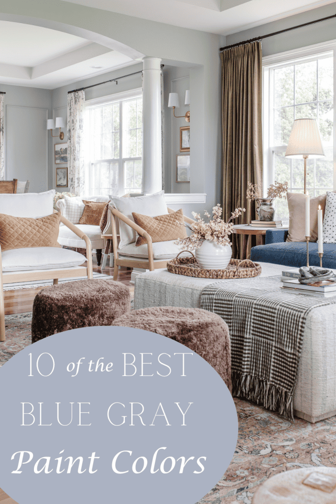
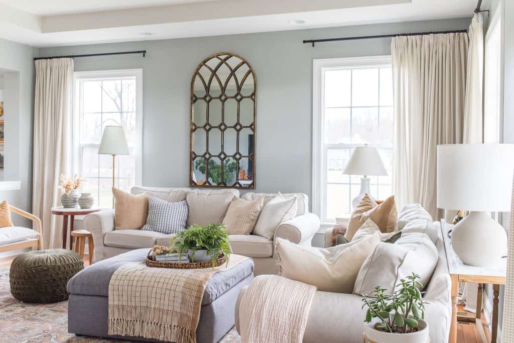
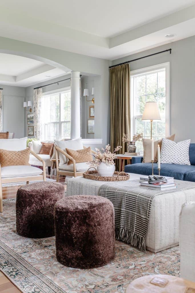
I painted our front living room and dining room Light Blue by Farrow and Ball and recently gave it a mini makeover but you can see how well the paint color works with the warmer colors I have in this room
Here are some cool colors and their effects:
Blue: Calmness, trust, and stability
Green: Growth, harmony, and relaxation
Purple: Creativity, luxury, and wisdom
Room Specific Color Choices
Living Room
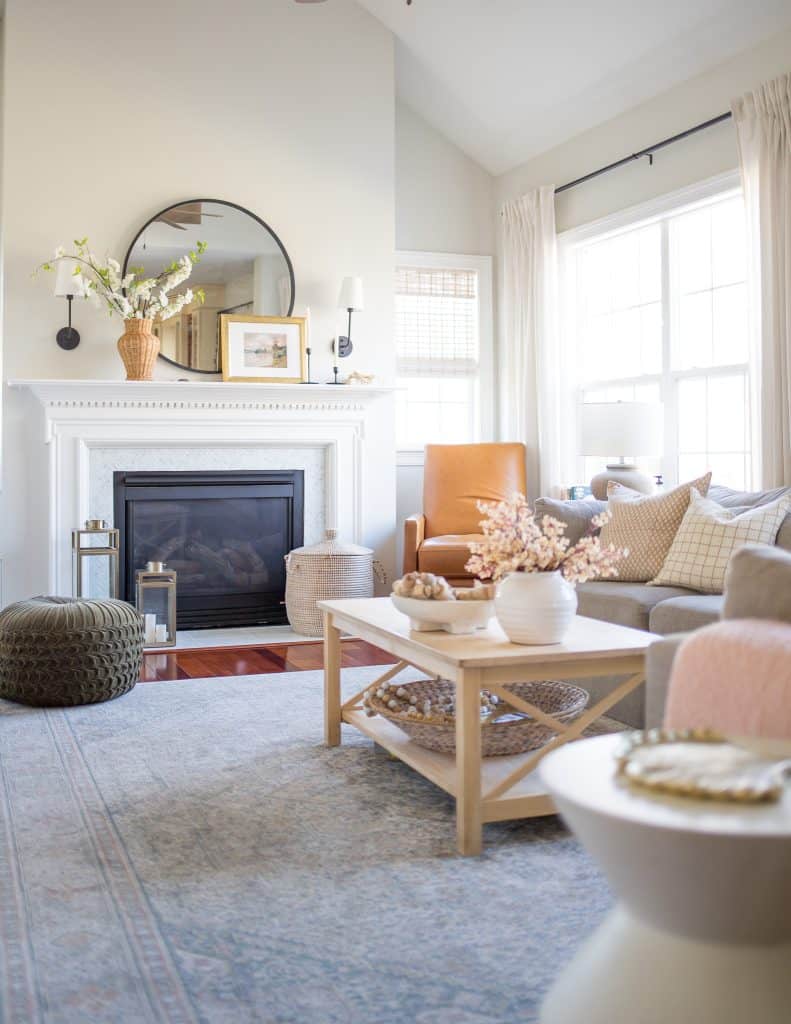
The living room is often the focal point of a home, and choosing the right color is very important. Neutral colors, such as greys, beiges, greiges and off-whites, work well in most living rooms as they provide a comfortable and welcoming atmosphere.
Greys: Lighter shades create an airy and spacious feel, while darker tones can make the room feel cozy and sophisticated.
Beiges/Greiges: Warm and inviting, beige complements most furniture and décor styles.
Off-whites: A blank canvas for any design style, off-white is a timeless choice for living rooms.
My living room is Silver Drop by Behr and it is on of my favorite paint colors.
I wrote a blog post about the best living room paint colors to help narrow down your search.
Kitchen
Kitchens tend to inspire more vibrant color choices. Colors associated with food and nature, such as greens, blues, and yellows, work well in this space.
| Colors | Associations |
|---|---|
| Greens | Fresh, energizing |
| Blues | Calm, clean |
| Yellows | Cheerful, bright |
Consider the size of the kitchen when choosing a color. Lighter shades can make small spaces feel larger, while darker colors work better in spacious kitchens.
We actually have limited wall space in our kitchen since our cabinets take up most of the space so I carried Silver Drop into our kitchen and it’s works pretty well in here.
Bedroom
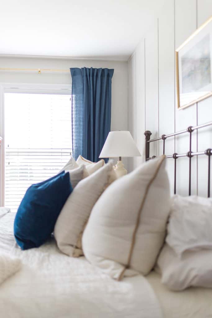
In the bedroom, aim for calm and relaxing colors. I painted our bedroom Silver Drop again since I love the color so much but blues, greens, and lavenders are great colors for a relaxing bedroom
Blues: Conducive to sleep, blue hues are ideal for bedroom walls. Choose a shade that complements your design style and furniture.
Greens: Soft, muted greens add a touch of nature and serenity to the bedroom.
Lavenders: Light, gentle lavender tones evoke soothing and peaceful energy, perfect for restful sleep.
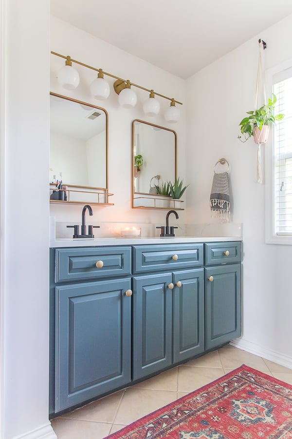
Bathroom
Bathrooms benefit from spa-like colors that create a sense of cleanliness and serenity. Whites, light blues, and soft greens are popular choices.
Whites: Crisp and clean, white provides a feeling of freshness and can be accented with colorful towels or accessories.
Light blues: Associated with water, light blue hues create a soothing atmosphere in the bathroom.
Soft greens: These tones lend a calming effect, reminiscent of a peaceful spa retreat.
I painted the my kids bathroom walls Simply White by Benjamin Moore.
Paint Finishes
Matte
Matte finish paint is a popular choice for interior walls due to its soft, non-reflective finish. It is ideal for low-traffic areas such as bedrooms and living rooms where a more subtle, cozy atmosphere is desired.
Matte paint is easy to apply and generally requires only two coats for full coverage. One of its drawbacks is its lower durability compared to other finishes, as it may not withstand frequent cleaning or high levels of moisture.
Semi-Gloss
Semi-gloss paint offers a balance between matte and gloss finishes with a medium level of reflectivity. This finish is more durable and easier to clean than matte, making it an excellent choice for high-traffic areas like kitchens, bathrooms, and hallways.
Semi-gloss paint typically provides good coverage with two to three coats and resists stains, moisture, and mildew. The downside to semi-gloss paint is that it can highlight imperfections, so it’s crucial to properly prepare the surface before applying.
Gloss
Gloss finish paint delivers a high level of shine and is the most durable option among interior paint finishes. Its highly reflective surface makes it suitable for highlighting architectural features and adding a touch of luxury to a space.
Gloss paint is ideal for areas like doors, cabinets, and trim, where a heavy-duty finish is required to withstand frequent cleaning and contact. On the downside, gloss paint tends to show imperfections more than other finishes, and it may take multiple coats to achieve full coverage.
Considerations for Small Spaces
When choosing a paint color for small spaces, it’s important to consider the room’s purpose and how much natural light your room gets.
Light colors, such as whites and pastels, tend to work best in smaller rooms as they reflect light and make the space appear larger.
However, even darker shades can create a cozy space
The room’s purpose should also influence the paint choice. In offices and other working spaces, neutral tones such as light grays or soft greens can help increase focus and productivity.
On the other hand, common areas like living rooms may benefit from warmer and more inviting colors, like yellows or beige, to create a welcoming environment.
This is when I didn’t take into consideration color psychology and painted my whole office Hague Blue by Farrow and Ball.

But I love the dark and moody room
Colors can also be used to influence the perception of the room’s shape and size. Painting an accent wall with a darker hue draws attention to that particular area and creates a visual focal point. This technique can help break up the monotony in a small space and provide a sense of depth.
The type of paint finish can influence the room’s appearance. Matte finishes tend to be better suited for smaller spaces as they minimize reflections and do not draw attention to imperfections or uneven wall surfaces.
On the other hand, semi-gloss or glossy finishes reflect light more efficiently and can make a room feel open and airy.
Trends in Interior Paint Colors
Related Post: Paint and Color Trends
In the past few years, interior paint color trends have shifted towards a more calming and earthy palette. One popular choice is muted pastels such as soft blues, pinks, and greens, which provide a gentle and soothing ambiance in a living space.
Another popular trend is the incorporation of neutral tones like beige, light grey, and off-white. These shades work well in most interiors and create a timeless aesthetic that can be easily updated or paired with more vibrant accents.

Bold colors are also making a huge comeback like I said, with jewel tones like emerald green, deep blue, and rich purple becoming increasingly popular. These colors add depth to a room while also making a strong statement.
Many homeowners and designers are now opting for nature-inspired hues that reflect the outdoors. This includes shades of green, ranging from pale sage to deep forest, and earthy tones like terracotta, rust, and ochre. These colors bring warmth and serenity to the space.
Pigeon by Farrow and Ball and becoming a very popular paint color lately.
Additionally, monochromatic schemes have gained popularity, wherein various shades of the same main color are utilized throughout the room. This can be achieved by using tints, tones, and shades of a single hue, resulting in a cohesive and harmonious design.
My Whole House Color Scheme
When we first moved into our house, I quickly just painted every wall Silver Drop by Behr since I wasn’t in the mood to be overwhelmed. Since then I have slowly been painting rooms as I see fit.
I wanted to live in our home a bit. Sometimes it’s just easier that way.

I have written blog posts almost all of these paint colors:
Silver Drop by Behr (one of my favorite paint colors)
Light Blue by Farrow and Ball (color matched by Behr)
Hague Blue by Farrow and Ball (also color matched by Behr)
Revere Pewter by Benjamin Moore (yes, I painted my interior doors this color)
Finding the best color to paint the inside of your house requires lots of tears and frustration. I’m just kidding. But it does take time and lots of inspiration to make the best choice for your home.
If you want to save this for later, you can pin it here:

You Might Also Like